|
|
|---|
Thursday, December 23, 2010
The stacks of iPads were put together, and then framed with the iconic black top and bottom of the iPhone, to make it look like a giant iPhone. There are 56 of the tablets installed, and all running the same looped video over and over again. Showing the mobile version of the latest Lara Croft adventure. World's biggest iPhone is 56 iPads
This project was born in 2006 when a Singaporean movie director and an ex musician from the south of China decided to open a live bar in Shanghai. The budget was very low but the client was incredibly good and open-minded to us. The schedule was very tight and fortunately they liked immediately one of the first concepts I proposed to them: a caved space formed from of a digital Boolean subtraction of hundreds of slices from an amorphic blob. The idea looks complex but actually is very simple and was born naturally from the digital 3D modelling environments where me and others enjoy playing with virtual volumes and spaces. Zebar by 3GATTI Architecture Studio
Saturday, December 18, 2010
The design incorporates a large cut-out on all four sides to prevent any little fingers from getting caught. Also the toy box is fitted with a lid stay to hold the lid safely in place while the children play.
Large enough in this configuration to hold most of a child's toys.
Made from high quality Birch plywood 1.5cm thick with a non-toxic paint finish in a choice of colour's.The Ogle Toy Box in the shape of a LEGO
Large enough in this configuration to hold most of a child's toys.
Made from high quality Birch plywood 1.5cm thick with a non-toxic paint finish in a choice of colour's.The Ogle Toy Box in the shape of a LEGO
The design has, unlike most floating houses, a very contemporary design without losing the characteristic appearance of the typical houseboat. The clients get a lot of positive reactions, it evens happens that people who pass by boat knock on the windows and ask if they can enter the boat.
Living on the water gets more and more popular in Holland. The clients/owners who come to our office always love the typical charms and characteristics of living on the water but don’t like the standard “caravan” appearance of the existing houseboats. More and more people want to live on a contemporary houseboat that has been designed for their specific needs, the houseboat at De Omval is an obvious example of this wish.
The clients wanted a boat with an open floor plan where they could enjoy the views to the water and the outdoor space to a maximum. The distinguished curved line of the facade directly derives from this desire and the restriction that the boat couldn’t be more than three meters above the water.
The living area and open kitchen are located on the waterfront, from here one has a panoramic view at the Amstel and you can enter the floating terrace. Following on from the living area and kitchen the bedroom is located on a split level. The split level introduces an open route to the ground floor of the boat and, at the same time, makes it possible to create a terrace on the south side without exceeding the maximum building height.
To accentuate the round lines of the facade it is carried out in with shiny aluminum.
The white plastered walls and ceilings follow the curve of the facade creating a seamless transition from the exterior to the interior.Watervilla de Omval in The Netherlands by +31ARCHITECTS
Sunday, December 12, 2010
For most people from many different disciplines a desk is the main workspace. A typical desk is composed of at least one or more vertical displays that show digital content and a larger horizontal area, containing input devices, such as mouse and keyboard, paper-based documents, and everyday objects. These two areas are clearly separated which makes it hard to move documents from one surface to the other. Furthermore, each area employs a different interaction technique. For example, we use the mouse for drawing on vertical displays but physical pens to annotate paper-based documents. BendDesk is our vision of a future workspace that allows continuous interaction between both areas.
BendDesk is a multi-touch desk environment that seamlessly combines a vertical and a horizontal surface with a curve into one large interactive workspace. This workspace can be used to display any digital content like documents, photos, or videos. Multi-touch technology allows the user to interact with the entire surface using direct manipulation and multi-touch gestures. We took special care for ergonomics. Users can comfortably sit at the desk and place everyday objects on it. Have a look at the video!BendDesk
BendDesk is a multi-touch desk environment that seamlessly combines a vertical and a horizontal surface with a curve into one large interactive workspace. This workspace can be used to display any digital content like documents, photos, or videos. Multi-touch technology allows the user to interact with the entire surface using direct manipulation and multi-touch gestures. We took special care for ergonomics. Users can comfortably sit at the desk and place everyday objects on it. Have a look at the video!BendDesk
The V-Two can transform in order to meet your needs and it can act either as a full sofa but also as two, apparently independent, armchairs connected by a handy table.V-Two Sofa
LAZERWOOD
iPhone4 wood cover "checker" in cherry
Using a water based stain then Laser etched , this limited run edition cover will grace your iphone 4 with a touch of class.
Thin but durable, REAL wood veneer* cover for the iPhone 4. Peel-and-stick backing make the covers easy to apply and remove without damage to the phone.
Created to work perfectly with the Apple bumper or you can use the included veneer sides to fix that reception issue.Lazerwood
Both the materials of the pillow cover and its filler are "Oeko Tex Standard" certificated, guaranteeing the high safety standard of our products. All materials used for the pillow are environmental friendly and are hypoallergenic even to baby's skin. The pillow cover can be easily taken off for washing.
Rolled Banknote Shape Pillow, US dollar
Rolled Banknote Shape Pillow, US dollar
Saturday, December 11, 2010
BK Medical's Red Dot Design Award winning Flex Focus 700 ultrasound systemMedical design
Sunday, December 5, 2010
consisting of three storeys, the space is defined from the north face structure,
a parallel free wall which houses a library containing 7,500 books and another parallel block.
all closed spaces contain rooms, bathrooms and storage areas. to access the wall of books
metal platforms are connected to the service block. the design takes advantage of the difference
between the street level and the lower level of the plot, by positioning the living room in the lower
level which ensures the required privacy and maintains the view of the distant landscape through
the void.alvaro puntoni: querosene house
Friday, December 3, 2010
Located in Nanjing City, China, this remarkable residential architecture building with minimalist concrete home design style has been designed by Atelier Zhanglei . Designed with a new form of concrete facade, the slit house exterior with almost entire structure even the roof are made from concrete with a 5 centimeter horizontal wood textile strips which share the same scale with neighbor buildings of brick build almost 100 years ago. Showing the transparency of the house in its public part with deep openings, limited on the east and west where the neighbors are. Stail is used in this project to link two parts which has half floor height difference, then made 2 floor height living area and 1.5 floor dining area.AZL Atelier Zhanglei
Thursday, December 2, 2010
Situated on the outskirts of downtown Tempe, home emit aesthetics industry. This is a modern home design called Sosnowski designed by Chen + Suchart Studio in Tempe, Arizona. A pronounced steel frame is built from the I-beam is a framework for volume up, which sits on the foundation of concrete blocks. The façade of the upper level consists of a serious window of the issued and natural weathering corrugated steel panels. Interior concrete floor mate, open ductwork, and light industry to create an atmosphere like an attic.


While pretending to industry, Residence Sosnowski remain habitable and inviting thanks to the main meeting room on the ground floor that combines living, dining and kitchen areas into one space that is fully open to the surrounding city and desert.


While pretending to industry, Residence Sosnowski remain habitable and inviting thanks to the main meeting room on the ground floor that combines living, dining and kitchen areas into one space that is fully open to the surrounding city and desert.


Labels: Modern Home Design
Wednesday, December 1, 2010
Monday, November 29, 2010
Friday, November 26, 2010
foster + partners' designs for the 'zayed national museum' in abu dhabi was revealed by
his highness sheikh mohammed bin rashid al maktoum, vice-president and prime minister
of the UAE and ruler of dubai and her majesty queen elizabeth II of the united kingdom.
conceived as a monumnet and memorial to the late sheikh zayed bin sultan al nahyan,
the founding president of the UAE, the museum will be the centrepiece of the saadiyat
island cultural district and will showcase the history, culture and more recently the social
and economic transformation of the emirates. foster + partners: designs zayed national museum in abu dhabi revealed
this first maison martin margiela store opened in tokyo in 2000. located in the ebisu area of the city,
the former residence incorporates the offices and sales rooms of kokonoe corp ltd.,
(the joint venture company in charge of the mason martin marginal brand in japan),
as well as a store on the ground floor. in february 2006, the store mores to another location in a former
electrical products factory building, still in the ebisu area. 'a wardrobe for men' by martin margiela
The office romances, the flirting at the photocopier, the disciplinary action
after the Christmas party… For a place so fraught with love and lust the
office is quite a dull place to look at - corporate sponsored mugs, tastefully
chosen comedy calendar and passive aggressive notes about borrowing
other peoples stationery all add up to ruin the romance of a day at work.
Luckily for your love life (or for your love of filing at least) we’ve come up
with something to put the passion back into your paperwork – our Heart
Hole Punch is a classically styled metal hole punch which punches 2 heart
shaped holes instead of round ones. The only hint to its secret is the subtle
heart shaped centre point. Who says romance can't be understated.Heart Hole punch
Thursday, November 25, 2010
Light. Strong. Handcrafted in Golden Colorado with love from us to you. Your Blackbox Case is lined with felt for comfort and only weighs as much as a full beer in a glass bottle. Solid Oak construction guarantees that your Apple Macbook Pro will live a life of luxury and safety. Blackbox Macbook Pro Cases
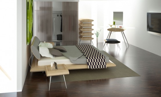
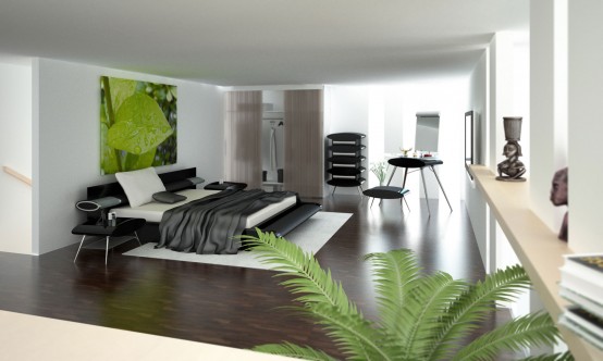
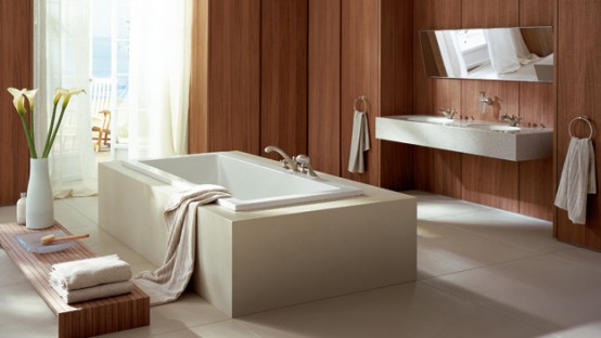
This is a minimalist home design choice for newly married young couples, because it does not require a large space for both. Minimalist is a pattern of thinking, working, and way of life. This is a new perspective in viewing design as a reflection of urban life is simple really practical, lightweight, efficient, and management. I thought it would seem useful to you young couples who want to create family harmony.
But keep in mind because it is too minimalist would be boring. For that we need a few tricks to design a minimalist home to keep your room look warm. Furniture selection model should also be considered, you must be able to choose the right furniture and of course accessories for your minimalist house with elements of practical and functional which is the basic key in designing a minimalist home.
But keep in mind because it is too minimalist would be boring. For that we need a few tricks to design a minimalist home to keep your room look warm. Furniture selection model should also be considered, you must be able to choose the right furniture and of course accessories for your minimalist house with elements of practical and functional which is the basic key in designing a minimalist home.
 plant design in the house
 Entrance to the garage minimalist home
 Multifunctional space design-Living room
Some tips for designing a minimalist home is not easily bored:
- Selecting the right material to thicken the minimalist concept will be presented. For example, glass furniture combined with aluminum or wrought iron can you attach it in the room. This is a simple form and can make your room look chic.
- The selection of minimalist furniture curtain capable of supporting the impression you want to display in your room. You can try to choose a light novel blind and able to give the impression of dynamic in a minimalist room.
- Furniture design company with a precision which is also characteristic of minimalist architecture and furnishings. Therefore, select a table or chair is simple and without ornament. With minimal ornament, we can simplify maintenance and the room will feel more spacious.
- Color Selection of minimalist design and stylish furniture should be cautious, the pattern of flowers or colors that are too crowded or less suitable when combined in a minimalist home. Keep the color tone each time to add or replace furniture and furniture accessories in one room.
- Whether all the accessories and furniture carefully, but make sure that the room did not impress too full because it can confirm the impression of a minimalist who wants to create. For example you can set the photo frame is bigger, but in small amounts to accent the room.
 Kitchen design minimalist home
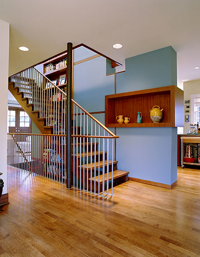
 Staircase design minimalist home
 Living room design
Minimalist can also be combined with colored wood furnishings such as furniture dark brown or reddish brown.
Tuesday, November 23, 2010
mosstile' by italian company benetti stone is a vertical maintenance free garden.
it is made using a stabilized tile of lichen placed over top of an ecologically sound resin base,
ready to be installed on any kind of surface. it does not require irrigation or fertilization,
nor does it need to be pruned. 'mosstile' can be placed in rooms without natural light as
it is not dependent on any particular environmental conditions. benetti stone: mosstile
The Table is inspired by the classic trestle table. Raw aesthetics and functionality is combined with high finish and a cohesive ralation between plate and trestleAA
Monday, November 22, 2010
KiBiSi has designed the Brick series for Versus. The series consists of a puf, a chair, a two and three seater. KiBiSi set out to make a sofa with strong architectural references since KiBiSi partner Bjarke Ingels couldn’t really find the right architect’s sofa for his apartment. The point of departure was a classic brick bond forming the cushion pattern. The cushions are tied together and fixed with a tailor quality button. The button, also designed by KiBiSi, is molded of fiber concrete – Yet another architectural reference.Brick
Advertising Agency: Publicis, Brussels, Belgium
Creative Directors: Alain Janssens, Paul Servaes
Art Director: Alex Gabriels
Copywriter: Wim Corremans
Photographers: Fred Van Hoof, Kurt Stallaert
Published: September 2010Post-it: Fridge, Monitor
Creative Directors: Alain Janssens, Paul Servaes
Art Director: Alex Gabriels
Copywriter: Wim Corremans
Photographers: Fred Van Hoof, Kurt Stallaert
Published: September 2010Post-it: Fridge, Monitor
This is the kind of bike you would ride during a bright sunny sunday in the middle of spring, with your newspaper under your arm, heading to you favorite breakfast bar. or at least this is what we are used to do in Italy.
Domenica.
Domenica.
Subscribe to:
Comments (Atom)


